GT's Synergy
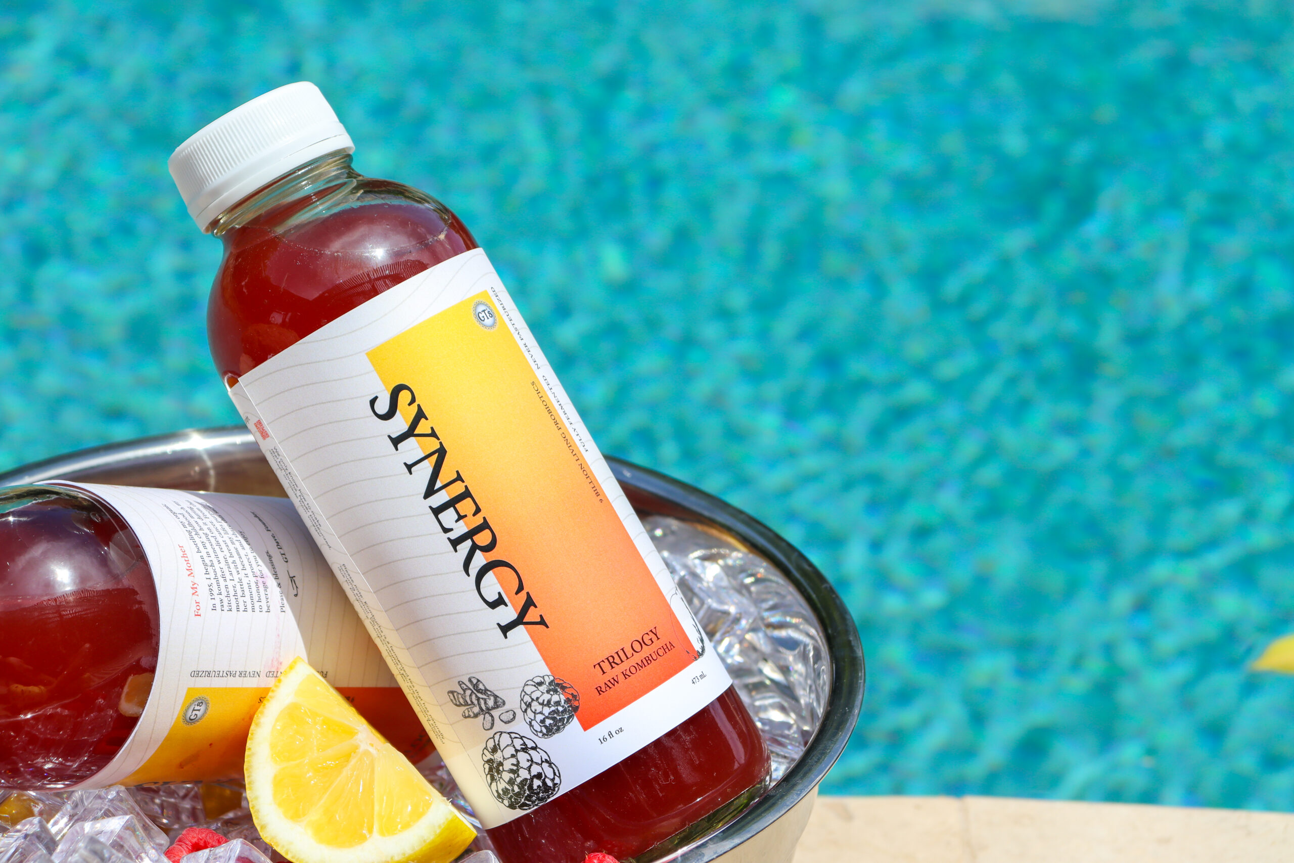
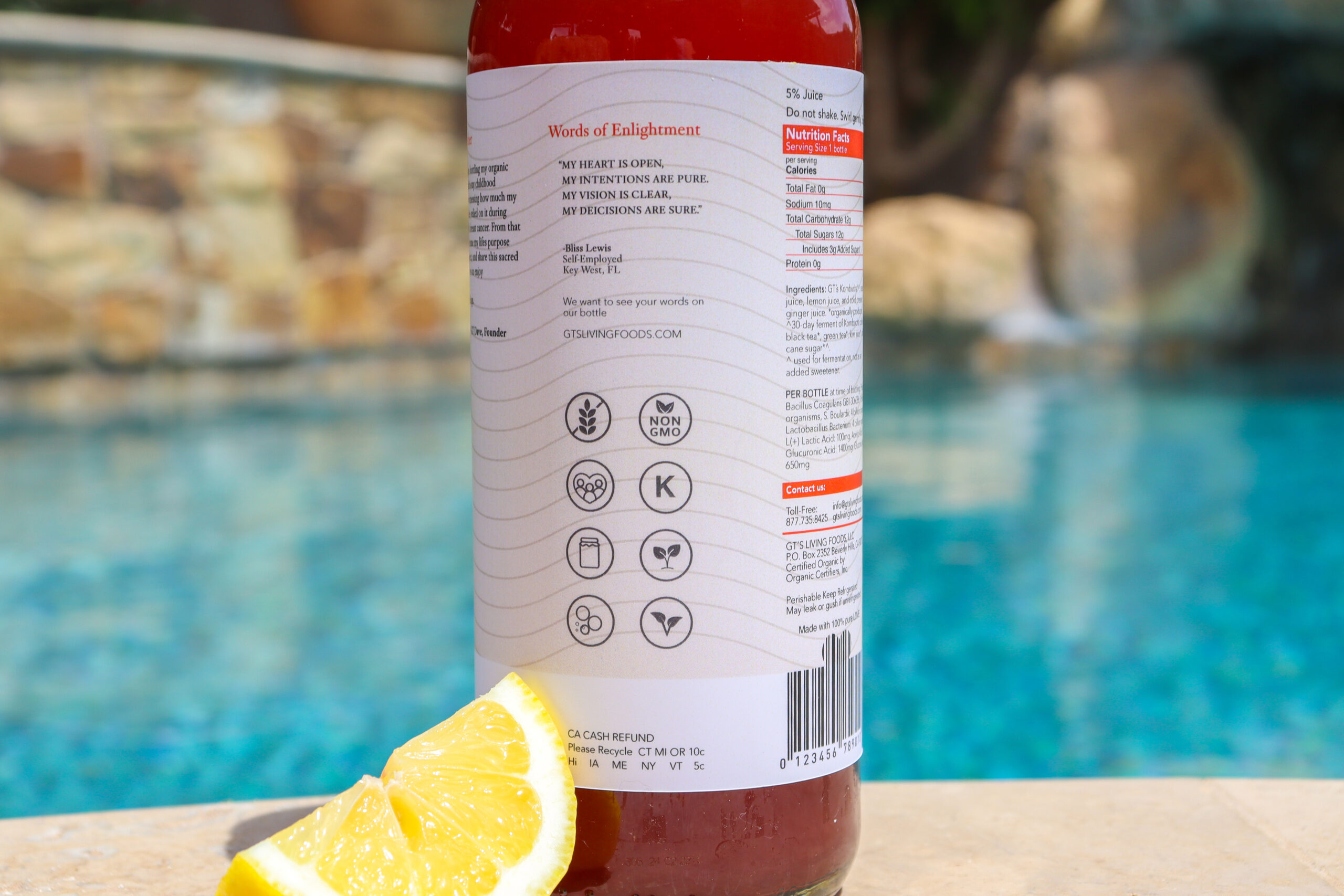
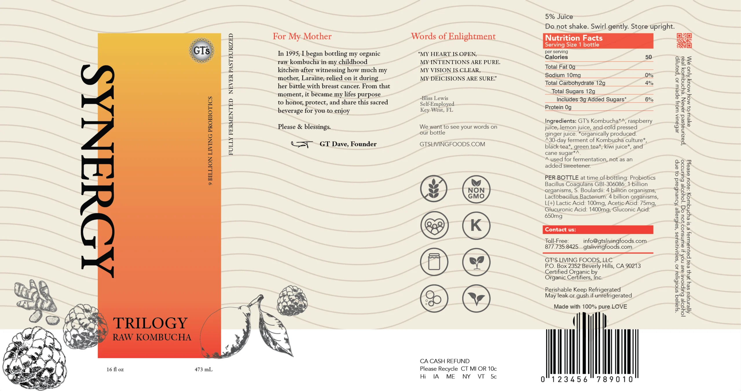
The Synergy label redesign focuses on clarity, balance, and approachability, bringing the packaging into closer alignment with the brand’s health-forward mission. A muted, natural color palette replaces the previously bright, sugary tones, creating an aesthetic that feels calmer, more modern, and more inviting. Improved contrast and subtle overlapping elements establish hierarchy, drawing attention to the product name while allowing supporting information to breathe. Refined color profiles and updated illustrations more clearly communicate flavor, reducing visual noise and strengthening shelf presence.